Here's another simple yet amazing dropdown menu with pure CSS3 made by Andrew from script-tutorials.com with some slight modifications so that it can be easily adapted to our Blogger template.
In the upper right side of this menu, we have the contact links and social media icons for Facebook, Twitter, Google Plus and RSS feed. Below these links, there is the drop-down navigation menu and on the left side, the search form.
To achieve a better user interface and interaction, the CSS dropdown menu features sub categories that appear with a nice touch of CSS3 box-shadow, text-shadow and a cool transition once the parent link is activated by a hover selector.

Step 2. Next, click anywhere inside the code area and press the CTRL + F keys to open the search box. Type the tag below inside the search box and hit Enter to find it.
Hope you like this CSS3 dropdown menu for Blogger and if you enjoyed the tutorial, please share and subscribe.
In the upper right side of this menu, we have the contact links and social media icons for Facebook, Twitter, Google Plus and RSS feed. Below these links, there is the drop-down navigation menu and on the left side, the search form.
To achieve a better user interface and interaction, the CSS dropdown menu features sub categories that appear with a nice touch of CSS3 box-shadow, text-shadow and a cool transition once the parent link is activated by a hover selector.
Adding the CSS dropdown navigation menu in Blogger
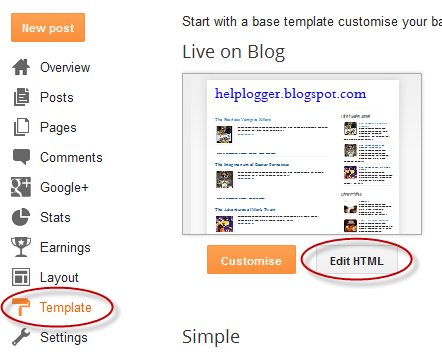
Step 1. Access your Blogger Dashboard and go to "Template", then click on the "Edit HTML" buttonStep 2. Next, click anywhere inside the code area and press the CTRL + F keys to open the search box. Type the tag below inside the search box and hit Enter to find it.
</header>Step 3. Just below </header> add the HTML structure of the dropdown menu:
<div id='contact-links'>
<div id='my-links'>
<a href='#'>About</a>
<a href='#'>Contact</a>
<a href='#'><img height='18px' src='https://blogger.googleusercontent.com/img/b/R29vZ2xl/AVvXsEi1e-PR3YCp3owiA2lSnBncAV4zMrtO6N4K6tfUbRb8QVuwTC3WhA5DUzmAR8yOzVULJx54OaJ898N5Y8fzQ0B6H6U7vkAEAhqY81oOKcrQ7NFfJquq29ByKVpNxtI4fGYbz7iuaf_Q6W6X/s1600/facebook-icon.png' title='Facebook' width='18px'/></a>
<a href='#'><img height='18px' src='https://blogger.googleusercontent.com/img/b/R29vZ2xl/AVvXsEgDFfac3fqF3WvNYHguEvHvs7Sy51nwFY9q8J7k5QOI4JHDJ4H7NLumCjGyJg89h7cKx1KnYatExsvJbFppp1mYm6FQ6zsayoaoG05bAJJmXVZjVXol2gHmzfl8s8CwMjbWNjQJWvVyYAp9/s1600/twitter.png' title='Twitter' width='18px' /></a>
<a href='#'><img height='18px' src='https://blogger.googleusercontent.com/img/b/R29vZ2xl/AVvXsEjFfQjkOXG9ErT9iFX5xaz_k3slGmfUkCvzAw5UN6C3KnMM3rDWphMFdgNBNBSH4Hg56d5OlaKNK-Hv6s1vv2vGdClOgE6F8ANktSfJhIo5_pexbSjK5eukTDqui-jxcohtFFDAC1CRaFQx/s1600/google-plus-icon.png' title='Google' width='18px'/></a>
<a href='#'><img height='18px' src='https://blogger.googleusercontent.com/img/b/R29vZ2xl/AVvXsEgfsGKAnygLe2kiO8vJ7HBrkeob78YueelwxxOsMcHezW-Z4XkNg24DnqhBVfWwjGl9R2mEaU8TRRUtQ7Cynjt1cQtvNk_6VgogOdh1JjnKpf4YrekNIOWWazbGu4tnFS7tlrgbN_z1q31I/s1600/rss-icon.png' title='RSS Feed' width='18px'/></a>
</div>
<div id='menu-container'>
<nav id='neat-menu'>
<ul>
<li class='active'><a href='/'>Home</a></li>
<li><a href='#'>Dropdown</a>
<ul>
<li><a href='#'>Menu element 1</a></li>
<li><a href='#'>Menu element 2</a></li>
<li><a href='#'>Menu element 3</a></li>
<li><a href='#'>Menu element 4</a></li>
<li><a href='#'>Menu element 5</a></li>
</ul>
</li>
<li><a href='#'>Dropdown</a>
<ul>
<li><a href='#'>Menu element 1</a></li>
<li><a href='#'>Menu element 2</a></li>
<li><a href='#'>Menu element 3</a></li>
<li><a href='#'>Menu element 4</a></li>
<li><a href='#'>Menu element 5</a></li>
</ul>
</li>
<li><a href='#'>Dropdown</a>
<ul>
<li><a href='#'>Menu element 1</a></li>
<li><a href='#'>Menu element 2</a></li>
<li><a href='#'>Menu element 3</a></li>
<li><a href='#'>Menu element 4</a></li>
<li><a href='#'>Menu element 5</a></li>
</ul>
</li>
<li><a href='#'>Single Menu</a></li>
<li><a href='#'>Single Menu</a></li>
<li><a href='#'>Dropdown</a>
<ul>
<li><a href='#'>Menu element 1</a></li>
<li><a href='#'>Menu element 2</a></li>
<li><a href='#'>Menu element 3</a></li>
<li><a href='#'>Menu element 4</a></li>
<li><a href='#'>Menu element 5</a></li>
</ul>
</li>
</ul>
</nav>
<!-- menu-search form -->
<div id='menu-search'>
<form method='get' action='/search'>
<input autocomplete='off' name='q' placeholder='search...' type='text' value=''/>
</form>
</div>
</div>
</div>
How to Set up the Dropdown Menu
- Replace the # symbols with the URLs of your links and replace the texts in blue with the titles that you want to appear in the menu.
- To change the social media icons, add the links of your icons instead of the ones in blue. For more help, please see this tutorial on how to upload and get the URL of an image.
- If you want to remove the sub categories, remove the code within the tags highlighted in yellow, including the ul tags. To remove only a menu element, remove the part that starts with <li> and ends with </li>
]]></b:skin>Step 5. Just above the ]]></b:skin> tag, add this CSS code:
#contact-links{text-shadow:0 -1px 0 rgba(0,0,0,0.3);margin:auto;position:relative;width:100%}#contact-links a{color:#4C9FEB}#contact-links a:hover{color:#3D85C6}#my-links{float:right;font-size:12px;margin:4px 10px;overflow:hidden;text-shadow:0 1px 0 #FFF}#my-links a{margin-left:7px;padding-left:8px;text-decoration:none}#my-links a:first-child{border-width:0}#menu-container{background:-webkit-linear-gradient(#f6f6f6,#e9eaea) repeat scroll 0 0 transparent;background:-moz-linear-gradient(#f6f6f6,#e9eaea) repeat scroll 0 0 transparent;background:linear-gradient(#f6f6f6,#e9eaea) repeat scroll 0 0 transparent;filter:progid:DXImageTransform.Microsoft.gradient(startColorstr='#f6f6f6',endColorstr='#e9eaea',GradientType=0);border-radius:0 0 4px 4px;border:1px solid rgba(0,0,0,0.1);box-shadow:-1px 1px 0 rgba(255,255,255,0.8) inset;clear:both;height:46px;padding-top:1px}#neat-menu{float:left}#neat-menu a{text-decoration:none}#neat-menu ul{list-style:none;margin:0;padding:0}#neat-menu > ul > li{float:left;padding-bottom:12px}#neat-menu ul li a{box-shadow:-1px 0 0 rgba(255,255,255,0.8) inset,1px 0 0 rgba(255,255,255,0.8) inset;border-color:#D1D1D1;border-image:none;border-style:solid;border-width:0 1px 0 0;color:#333;display:block;font-size:14px;height:25px;line-height:25px;padding:11px 15px 10px;text-shadow:0 1px 0 #FFF}#neat-menu ul li a:hover{background:-webkit-linear-gradient(#efefef,#e9eaea) repeat scroll 0 0 transparent;background:-moz-linear-gradient(#efefef,#e9eaea) repeat scroll 0 0 transparent;background:linear-gradient(#efefef,#e9eaea) repeat scroll 0 0 transparent;filter:progid:DXImageTransform.Microsoft.gradient(startColorstr='#efefef',endColorstr='#e9eaea',GradientType=0)}#neat-menu > ul > li.active > a{background:-webkit-linear-gradient(#55A6F1,#3F96E5) repeat scroll 0 0 transparent;background:-moz-linear-gradient(#55A6F1,#3F96E5) repeat scroll 0 0 transparent;background:linear-gradient(#55A6F1,#3F96E5) repeat scroll 0 0 transparent;filter:progid:DXImageTransform.Microsoft.gradient(startColorstr='#55A6F1',endColorstr='#3F96E5',GradientType=0);border-bottom:1px solid #2D81CC;border-top:1px solid #4791D6;box-shadow:-1px 0 0 #55A6F1 inset,1px 0 0 #55A6F1 inset;color:#FFF;margin:-1px 0 -1px -1px;text-shadow:0 -1px 0 rgba(0,0,0,0.3)}#neat-menu > ul > li.active > a:hover{background:-webkit-linear-gradient(#499FEE,#3F96E5) repeat scroll 0 0 transparent;background:-moz-linear-gradient(#499FEE,#3F96E5) repeat scroll 0 0 transparent;background:linear-gradient(#499FEE,#3F96E5) repeat scroll 0 0 transparent;filter:progid:DXImageTransform.Microsoft.gradient(startColorstr='#499FEE',endColorstr='#3F96E5',GradientType=0)}#neat-menu > ul > li:first-child > a{border-radius:0 0 0 5px}#neat-menu ul ul{background:-webkit-linear-gradient(#F7F7F7,#F4F4F4) repeat scroll 0 0 padding-box transparent;background:-moz-linear-gradient(#F7F7F7,#F4F4F4) repeat scroll 0 0 padding-box transparent;background:linear-gradient(#F7F7F7,#F4F4F4) repeat scroll 0 0 padding-box transparent;filter:progid:DXImageTransform.Microsoft.gradient(startColorstr='#F7F7F7',endColorstr='#F4F4F4',GradientType=0);border-radius:5px 5px 5px 5px;border:1px solid rgba(0,0,0,0.1);box-shadow:0 1px 0 #FFF inset;height:0;margin-top:1px;opacity:0;overflow:hidden;width:240px;padding:0;position:absolute;visibility:hidden;z-index:1;-webkit-transition:all .5s;-moz-transition:all .5s;-ms-transition:all .5s;-o-transition:all .5s;transition:all .5s}#neat-menu ul li:hover ul{margin-top:0\2;height:auto;opacity:1;visibility:visible}#neat-menu ul ul a{border-right-width:0;border-top:1px solid #D1D1D1;box-shadow:0 1px 0 #FFF inset;color:#444;height:24px;line-height:24px;padding:7px 12px;text-shadow:0 1px 0 #FFF}#neat-menu ul ul a:hover{background:-webkit-linear-gradient(#55A6F1,#3F96E5) repeat scroll 0 0 transparent;background:-moz-linear-gradient(#55A6F1,#3F96E5) repeat scroll 0 0 transparent;background:linear-gradient(#55A6F1,#3F96E5) repeat scroll 0 0 transparent;filter:progid:DXImageTransform.Microsoft.gradient(startColorstr='#55A6F1',endColorstr='#3F96E5',GradientType=0);border-top:1px solid #4791D6;box-shadow:-1px 0 0 #55A6F1 inset,1px 0 0 #55A6F1 inset;color:#FFF;text-shadow:0 -1px 0 rgba(0,0,0,0.3)}#neat-menu ul ul li:first-child a{border-top-width:0}#menu-search{margin:8px 10px 0 0;float:right}#menu-search form{background:url(https://blogger.googleusercontent.com/img/b/R29vZ2xl/AVvXsEgHpDvgmixpjso7KBAoXdrLM5eEAupMizrDlJs5ZXsdnED2HGkraU1sQsSc4EQLuqMtXZASk-OKy-xfDN5xD10fOGmS7-dHtrt3b0IooHaPqzihpkB94CMyE6lbGdCMuJ417iATtdBk0FJ5/s1600/menu-search.gif) no-repeat scroll 5% 50% transparent;border:1px solid #CCC;border-radius:3px 3px 3px 3px;box-shadow:0 1px 0 rgba(0,0,0,0.05) inset,0 1px 0 #FFF;height:26px;padding:0 25px;position:relative;width:130px}#menu-search form:hover{background-color:#F9F9F9}#menu-search form input{color:#999;font-size:13px;height:26px;text-shadow:0 1px 0 #FFF;background:none repeat scroll 0 0 transparent;border:medium none;float:left;outline:medium none;padding:0;width:100%}#menu-search form input.placeholder,#menu-search form input:-moz-placeholder{color:#C4C4C4}Step 6. Click on the "Save template" button to save the changes and you're done!
Hope you like this CSS3 dropdown menu for Blogger and if you enjoyed the tutorial, please share and subscribe.


